とりとめないメモ。
HTMLとCSSのことで、よくやるやつとか、忘れそうなこと、自分なりのやり方など、ただの備忘録を取り留めもなく、書き記してゆきます。その目次ページ。
メモのメモ
「とりとめないメモ」のソースコードだけを書き出したページです。
ふくろ文字
<div class="outline-text" data-text="ふくろ文字">ふくろ文字</div>.outline-text {
position: relative;
color: white;
font-size: 100px;
-webkit-text-stroke: .1em indigo;
}
.outline-text::before {
content: attr(data-text);
position: absolute;
-webkit-text-stroke: 0;
}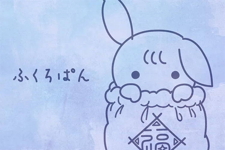
ふくろ文字
3行めの末尾を三点リーダーで端折る
.excerpt {
	display: -webkit-box;
	-webkit-line-clamp: 3;
	-webkit-box-orient: vertical;
	overflow: hidden;
}
三点リーダーで端折る
絶対配置をそのままレスポンシブしたいとき
1200pxの時に120pxの要素は、100vwの時には10vwである。
.element {
	width: min(323vw / 12, 323px);
	font-size: min(24vw / 12, 1.5rem);
}
絶対配置をレスポンシブしたいとき
動くリンク下線
.link-underline a {
	background: linear-gradient(currentcolor, currentcolor) left bottom / 100% 1px no-repeat;
}
@media (hover) {
	.link-underline a {
		transition: background-size .4s cubic-bezier(.3,1,.7,1);
	}
	.link-underline a:hover {
		background-position: right bottom;
		background-size: 0 1px;
		transition-duration: .2s;
	}
}
動くリンク下線
ローディングのくるくる
<div class="loader">
	<svg width="100" height="100" viewBox="0 0 100 100" class="svg">
		<circle cx="50" cy="50" r="40"/>
	</svg>
</div>
.loader .svg {
fill: none;
stroke: dodgerblue;
stroke-width: 10;
stroke-linecap: round;
stroke-dasharray: 230 230;
animation: loader 1.4s infinite cubic-bezier(.4,0,.3,1), loading 1.2s infinite linear;
}
@keyframes loader {
from { stroke-dashoffset: 230; }
to { stroke-dashoffset: -230; }
}
@keyframes loading {
from { transform: none; }
to { transform: rotate(360deg); }
}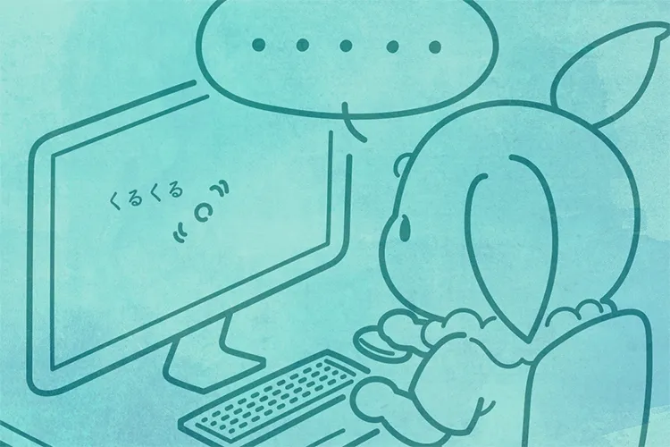
ローディングくるくる
コンテナからの解放
.breaking-out {
	margin-right: calc(50% - 50vw);
	margin-left: calc(50% - 50vw);
}
コンテナからの解放
スクロールバーを消す
.container {
	overflow-y: scroll;
	scrollbar-width: none;
	overscroll-behavior: contain;
	-webkit-overflow-scrolling: touch;
}
.container::-webkit-scrollbar {
	display: none;
}
きれいな段落
.paragraph {
	text-indent: 1em;
	text-align: justify;
	font-feature-settings: "palt" 1;
	line-break: strict;
	overflow-wrap: break-word;
	hanging-punctuation: last allow-end;
}
.paragraph [lang="en"] {
	hyphens: auto;
}
.paragraph .url {
	word-break: break-all;
	text-justify: inter-character;
}
言語を明示したり、ハイフネーション位置を明示したり、分割したくない文字をくっつける。
日本語の文章には不意に<span lang="en">english words</span>が入ることもあるし、Su­per­cali­frag­ilis­tic­ex­pi­ali­do­cious<small>(望みを叶えてくださる言葉)</small>みたいな行頭・行末の禁則処理によるアキやスペースの帳‍尻合わせも相まって、
きれいな段落
インラインの行を分断する
.lead {
	padding: .5em 1em;
	-webkit-box-decoration-break: clone;
	box-decoration-break: clone;
}
テキストが現れる
<p class="text-appear">あのイーハトーヴォのすきとおった風、<br>夏でも底に冷たさをもつ青いそら、<br>うつくしい森で飾られたモリーオ市、<br>郊外のぎらぎらひかる草の波。</p>.text-appear {
display: inline;
mask: linear-gradient(white, white) left center / 0 100% no-repeat;
background: linear-gradient(currentcolor, currentcolor) right center / 100% 100% no-repeat;
transition: mask-size cubic-bezier(.7,0,.3,1), background-size cubic-bezier(.3,1,.7,1);
}
.text-appear.is-appear {
mask-size: 100% 100%;
background-size: 0% 100%;
transition-duration: 1s;
transition-delay: 0s, .6s;
}video要素に指定する属性
<video preload muted loop autoplay playsinline disablepictureinpicture controls controlslist="nofullscreen nodownload noremoteplayback noplaybackrate" poster="media/poster.webp" width="1280" height="720">
	<source src="media/video.webm" type="video/webm"/>
	<source src="media/video.mp4" type="video/mp4"/>
</video>フォントサイズを線形補完
.subject, .paragraph {
	--slope: calc( (var(--fontMax) - var(--fontMin)) / (var(--containerMax) - var(--containerMin)) );
	--diff: calc( var(--containerWidth) - var(--containerMax) * 1px );
	--lerp: calc( var(--fontMax) * .0625rem + var(--slope) * var(--diff) );
	--fontSize: clamp( var(--fontMin) * .0625rem, var(--lerp), var(--fontMax) * .0625rem );
	font-size: var(--fontSize);
}:root {
--containerWidth: 100vw;
--containerMin: 375;
--containerMax: 600;
}
@media (min-width: 768px) {
:root {
--containerMin: 768;
--containerMax: 1200;
}
}
.subject {
--fontMin: 18;
--fontMax: 24;
}
.paragraph {
--fontMin: 14;
--fontMax: 18;
}